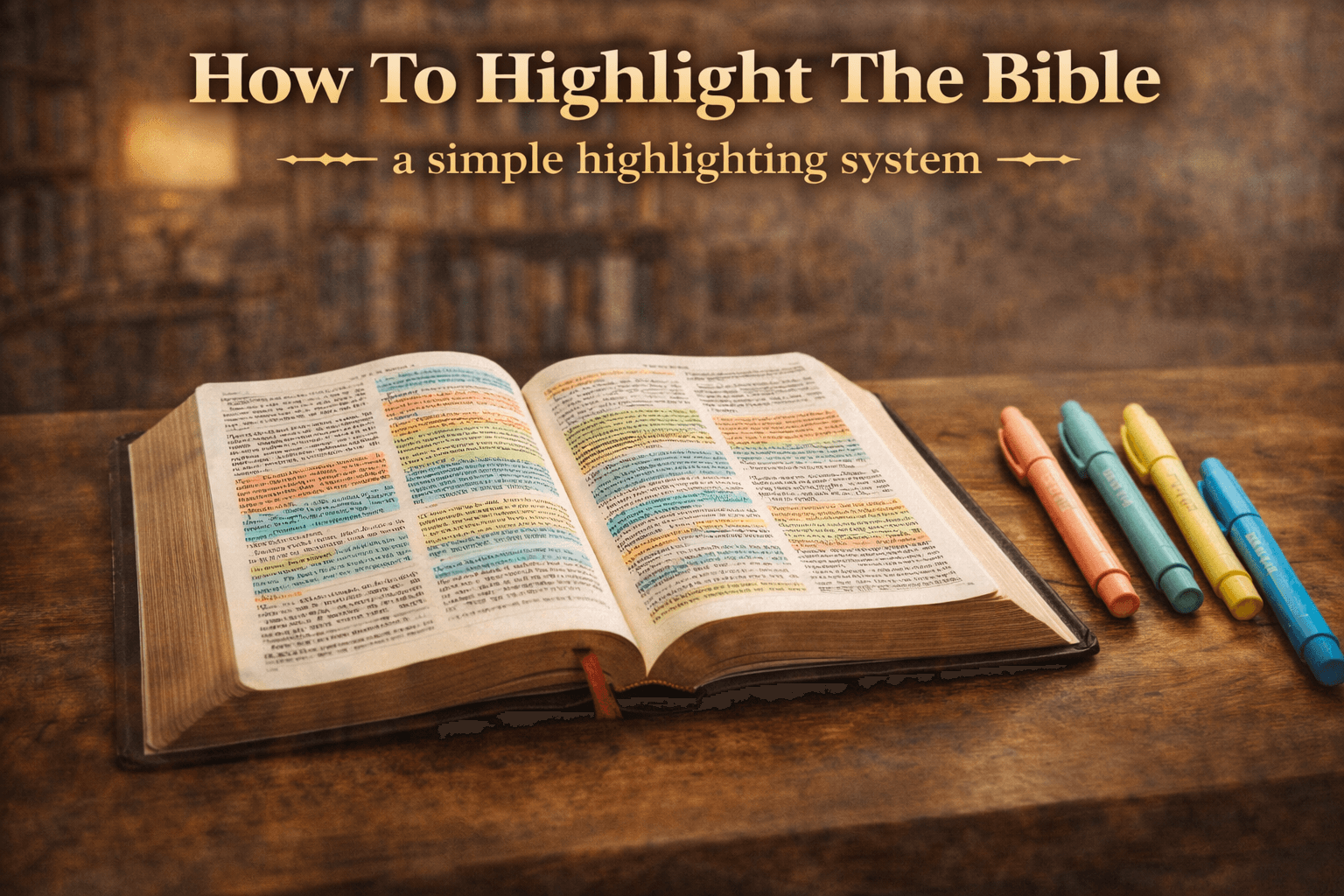
A Simple Bible Highlighting System
How to Highlight With Purpose
When many people first begin studying the Bible, highlighting feels automatic.
Everyone highlights.
So it must be helpful.
A yellow highlighter comes out.
Verses start glowing.
Pages become colorful.
And at first, it feels productive.
But weeks later, those same pages are opened again.
And a question appears.
Why was this highlighted?
What did this mean?
What was the purpose?
Highlighting without intention does not create clarity.
It creates color.
And color alone does not produce understanding.
🎨 More Colors Is Not the Solution
When simple highlighting feels confusing, the next instinct is often to add more colors.
- 🔵 Blue
- 🟢 Green
- 🟣 Purple
- 🔴 Red
- 🟡 Yellow
- 🟠 Orange
More color feels more serious.
More organized.
More spiritual.
But without structure, even six colors become random.
Months later, pages look vibrant.
But the meaning behind the colors is forgotten.
Blue for what?
Green for why?
What was the logic?
Color without purpose turns into decoration.
And decoration does not deepen understanding.
❓ Why Highlight at All
Before choosing colors, the real question must be asked.
Why highlight in the first place?
Not because others do it.
Not because it looks good.
But because highlighting serves a purpose.
A clear highlighting system should allow someone to return later and instantly see:
- 📌 What was confusing
- 📌 What revealed something about God
- 📌 What connected to other parts of Scripture
- 📌 What personally convicted or encouraged
Highlighting is not about decoration.
It is about communication with your future self.
📖 Why Many Systems Fail
There are many Bible highlighting systems available.
Some are complex.
Some are overly detailed.
Many work well in one part of the Bible.
And then collapse in another.
The Bible contains:
- 📜 History
- 🔥 Prophecy
- 🧠 Wisdom
- 🎵 Poetry
- ✉️ Letters
- 📖 Narrative
A system that only works in Psalms may not work in Leviticus.
A system designed for the Gospels may struggle in Revelation.
Too many systems become complicated.
And when complexity increases, consistency decreases.
A good system must be simple.
Repeatable.
Flexible across every genre.
🖍 A Simple Four Color System
The colors themselves do not matter.
There is no spiritual meaning attached to blue or green or yellow.
What matters is what the color represents.
Each color should answer one clear question.
🍑 Peach: What Is Not Understood
Anything unclear receives this color.
A confusing word.
A difficult phrase.
A theological tension.
An unfamiliar concept.
Peach signals:
- 📌 This needs deeper study
- 📌 Do not skip this
- 📌 Confusion exists here
Confusion is not failure.
It is an invitation to learn.
This color keeps study honest.
🔵 Blue: God and Jesus
Blue marks anything directly about God or Jesus.
Statements about who God is.
Commands given by God.
Promises spoken by Jesus.
Descriptions of divine character.
This color answers:
Who is God in this passage?
When flipping through pages filled with blue, patterns emerge.
Attributes repeat.
Themes strengthen.
The character of God becomes clearer.
🟢 Green: Connections
The Bible contains thousands of cross references.
Verses connect across centuries.
Themes echo.
Stories mirror each other.
Green highlights those connections.
- 🔗 Old Testament fulfilled in the New
- 🔗 Repeated themes across books
- 🔗 Parallel accounts
- 🔗 Prophecy and fulfillment
Green reveals that Scripture is not random.
It is layered.
Intentional.
Interwoven.
🟡 Yellow: Personal Impact
Yellow is personal.
It marks moments of:
- 💛 Conviction
- 💛 Encouragement
- 💛 Comfort
- 💛 Correction
This color answers one question:
What is God pressing on the heart right now?
Over time, yellow sections tell a story of growth.
Patterns of struggle.
Seasons of encouragement.
Moments of clarity.
📈 What Happens Over Time
Months later, pages tell a story.
Peach reveals past confusion that has now been resolved.
Blue shows repeated truths about God.
Green exposes patterns woven throughout Scripture.
Yellow traces spiritual growth.
The Bible becomes more than a text.
It becomes a record of understanding.
Highlighting becomes a reference system.
Instead of rereading everything, the eyes quickly recognize:
- 📌 Areas that need review
- 📌 Truths about God
- 📌 Major connections
- 📌 Personal lessons
This is not decoration.
It is intentional indexing.
🔄 When Colors Overlap
Some verses fit more than one category.
That is normal.
In those cases:
- 📌 Choose the color that fits best
- 📌 Or add a small secondary mark nearby
The system serves the text.
The text does not serve the system.
Flexibility prevents frustration.
✨ The Goal Is Clarity
There is no perfect highlighting system.
The goal is not perfection.
The goal is clarity.
If highlighting feels overwhelming, the solution is not more colors.
It is more intention.
Highlight with purpose.
Highlight so that future understanding builds on present insight.
That is how highlighting becomes a tool for growth instead of just color on a page.